There’s a running joke in the development world that the worst programmer you’ll ever meet is yourself from six months prior. When you open up code you wrote three years ago, you’d better be ready for bats to start flying out.
I recently updated the iOS version very first app I ever wrote, Time Converter 24, to an iOS 7-only ground-up rewrite.
I wanted to mark the occasion by walking through some of my process and a bit of what I’ve learned over the last three years – going from barely being able to write a for loop to writing the entire backend for a Best New App.
Design and UX
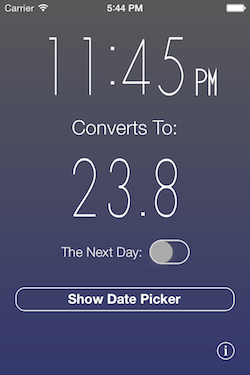
Here’s what the main page of TC24 used to look like, when I initially built it in early 2011:
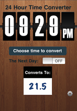
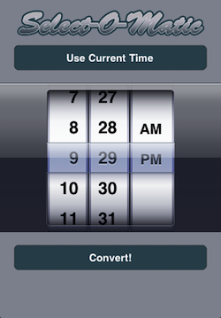
Looking at it from a POV of 3 years later: Yeesh. The wood background! The super-skeuomorphic clock! The Marker Felt font! The…what IS that font/button color? The picker on a totally separate screen that uses a chromed logo for no reason other than I could!
About half of this was the design language of iOS 4, but a goodly chunk of it was the fact that I didn’t understand a bunch of fundamental concepts of design and user experience.
Particularly the decision to make the picker be on a second page was a pretty silly one, in retrospect. Making users completely change contexts in order to perform one of the main functions of the app is a terrible idea from a UX perspective.
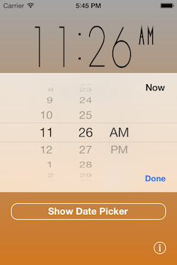
I realized a good ways into development that the flip clock could be kind of hard to read, so added an option to have a clock that looked like this – I based the design on my alarm clock at home:
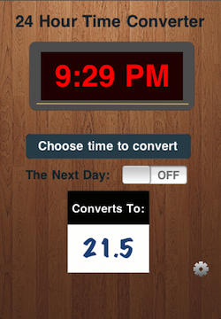
Still skeuomorphic, but at least a bit more readable. I should have realized my decision to add this meant that the flip clock wasn’t the greatest idea – when making a simple utility app, if your users have a hard time reading a big chunk of the UI, you’ve fucked up.
But at the time, I mostly wanted to prove that I could actually have a setting that the app would remember across launches, rather than thinking at all about what users would want.
A couple of things haven’t changed since 2011: I’m still pretty terrible at Photoshop, mostly using it to make amusing images of cats rather than anything resembling app UI.
So taking my suckitude at Photoshop but my better understanding of how to build apps into account, here’s what the main page looks like now on a 4″ screen:
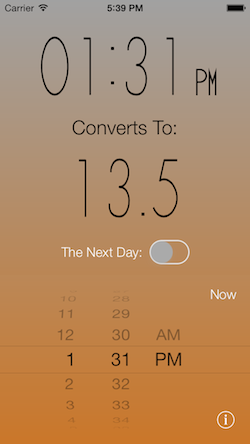
There’s still some flashiness to it – the numbers animate similar to Timely thanks to T.J. Fallon’s MFLTransformingDigits library, but everything is nice and big and readable.
Tappable items will always be white – non-tappable items will change color as the user spins the date picker through the day. The background color of the app fades between a dark blue at midnight to a nice bright orange during the day, giving the user additional cues about the time of day they’re selecting to perform their calculations on.
I was a little annoyed that I couldn’t change the color of the text in the UIDatePicker to match the rest of the tappable items, but not annoyed enough to use one of the libraries that overrides UIPickerView and replaces it. If the ability to adjust that color easily is added in iOS 8, I’ll definitely be updating that.
There are a few pieces of the puzzle that are a little different on a 3.5″ phone – I debated slapping the whole thing into a UIScrollView and calling it a day, but the fight between the scrollview and the UIDatePicker was a little obnoxious, so I decided to do something similar to what I probably should have done with the date picker in the first place:
While the need for a background for the UIDatePicker prevented me from keeping the white-to-tap language on the 3.5″ screen, I’m still pretty happy with how this turned out.
The entire clear area around the date picker is tappable to dismiss the picker, and I was able to find a hack for getting that frosted background on the UIDatePicker to set it off from the rest of the background.
How To Use System Components
The settings screen on v1.0 was…pretty terrible. I really didn’t understand TableViews, but the only sample code I could find for dealing with in-app purchases was in a TableView.
Thus was born this silliness:
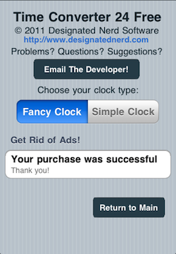
The Grouped TableView Background looks pretty fugly to our iOS 7 eyes, but there are just so many other things wrong with this.
For some reason, I decided to do away with the UINavigationBar and Done button the utility app template provided for free, and make my own damn “return to main” button. This was dumb on a number of levels, not least of which was that it moved the button to return the user to the main page to a really unexpected position.
Trying to have a borderless button “link” to my website was just a fundamental misunderstanding of app UI at the time – although hilariously, this actually wouldn’t look totally out of place in iOS 7 due to the change in design language.
The utter lack of attention I paid to spacing in the top portion is pretty mortifying – I was so focused on just getting the damn thing to work properly, I let quite a few visual details slide.
The biggest issue is that I put the information that was important to me well before anything that was actually important to the user. It’s basically a big I MADE THIS sticker I slapped all over the damn thing, before anything that the user actually wanted to do.
Having removed a few options, and having a better idea of how to build a settings page, I stripped it down to its bare necessities and used a UITableView in the new version:
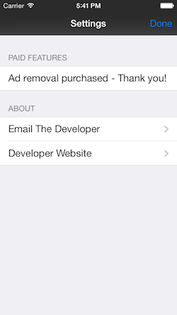
Only the basics, cleanly organized and grouped. The one option on this app that’s most relevant to the user – the ability to get rid of ads – placed front and center, before any credits or contact information. The Done button in a place the user would actually look for a Done button.
I will also say that I strongly prefer the look of the iOS 7 grouped table view to the iOS 6- version, which helped in making this decision.
Efficient Use of Library Code
The biggest difference between then and now is my understanding of dependency management. Back then, I at least understood that building reusable components was a good idea, but I had no idea how to leverage other people’s code (or even my own) beyond copying and pasting.
In order to piss off the maximum number of dependency management partisans, I used both Git submodules and CocoaPods for TC24 2.0 – Pods for my private repos and wherever they were set up for public repos, and submodules wherever they weren’t.
I’ve grown to like submodules a bit better after wrapping my head around them since I started at Vokal, but the ability to add the library code without adding all the sample code with Pods does tend to tip me in that direction on a more regular basis.
I already mentioned MFLTransformingDigits, but there are a few other pieces to this app that were made a hell of a lot easier by library code – some of it open-source, and some of it my own.
My three initial apps all do some variation on a theme of taking “normal” time and converting it into a 24 hour decimal time. This was a good idea because it allowed me to slowly tackle more and more complicated and more visually sophisticated ideas.
However, when I first built my apps, I did shared code the super-n00b way: I copied and pasted code. Anytime I had to fix something in one app, I had to fix the other two apps and retest them completely.
I’d recently updated Flight Time Converter with only a fairly simple iOS 7 UI refresh, but with a complete behind the scenes rewrite of most of the codebase.
I managed after some difficulty to get a private CocoaPods repo up and running, allowing me to componentize two of the largest pieces of code that are shared across both apps: The time calculation engine (which is now unit-tested) and the In-App Purchase manager.
I was able to get these two key features added to TC24 2.0 in seconds after getting them perfected in FTC 2.0, and be assured that there would be absolutely no difference in their functionality across the apps, which saved me a ton of time.
In addition to MFLTransformingDigits, I used a couple other public libraries:
- Lars Anderson’s LARSAdController allowed me to deal with iAd and Google AdMob integration with approximately zero setup, saving me from a ton of work creating something like this as a UIViewController subclass of my own.
- Charles Powell’s UIColor+CrossFade category knew way more about how to move between R/G/B values mathematically than I did.
What Next?
While I’ll be pretty busy working on updates for Hum, I have every intention of updating the Android versions of both Flight Time Converter and Time Converter 24.
I’m particularly excited to dive into the dependency management power of Gradle, and see what I can do to translate these designs to Android in a way that makes sense. I’m a strong advocate of platform-appropriate design, so I’d like to put my money where my mouth is on that one.
Overall, though, I’m just excited to see Time Converter 24 get a second life. It was something I built because it I wanted to use it, and it showed me the potential of this whole app development thing that has become my work and my passion over the last three years.
Hope you enjoy it.